The term oxymoron comes from the Greek. It is the combination of oxus, which means sharp, and moros, which means foolish. So, it means sharply foolish. It is often an expression or figure of speech in which the words together seem to contradict each other. A great example of an oxymoron is working vacation. In the era of COVID, we are all working at home, and even when we are on vacation, we still get phone calls, texts, and emails. How about when you need an impossible solution? Or when small power failures happen every day. We called these routine emergencies.
I spent half of my career working for a power company, a lot of it running operations. But, to be truthful, the organization did a lot more than operations. The crews built infrastructure, performed maintenance of devices, inspected, tested all kinds of things and did many administrative tasks. But true operations happen when things don't go as planned.
Often when faced with these events, I acted as a one-man-band. I had to make decisions in the deafening silence of the control room. The term management comes from the Italian maneggiare, which means “to handle.” Was I able to handle uncontrollable situations? If the answer is no, then operations management is an oxymoron. How can one handle uncontrollable situations?
I'll never forget a situation when I got the phone call an operations person never wants to get. A major substation feeding the hospital district of the city was on fire. All the primary and backup feeders were fried. As a result, every hospital was out of power, along with a vast urban, low-income residential community. Oh, I forgot to mention, it was during a brutal heat and humidity spell in the middle of August. The phone lines were jammed. Customers kept getting busy signals. The mayor wanted my head. Yes, during this situation, my only choice was to lay temporary cables in the streets. And hope for the best.
Yes, for me, then operations management was indeed an oxymoron.
Maybe not an oxymoron?
How can we add some structure to these events and at least turn them into organized chaos? The events that I faced running operations had one thing in common. Location. And, of course, GIS is all about location. Using GIS, there are three ways that operations management can make sense out of the chaos of unplanned events, like a fire in a substation, damage due to an earthquake, or a sudden wildfire.
The three ways are capture, understand and share.
Capture
When faced with one of these situations, I gathered information from many different sources, such as paper maps, notes, emails, news, traffic and weather reports. Then, as the decision-maker, I had to consolidate this information in my head to make sense of the data. That was tough and risky. However, GIS has the unique ability to organize all that data in one place. GIS provides that ah-ha moment. I can see where floodwaters are flowing, the wind direction toward my transmission lines or where the most vulnerable people are. It could even see where the event might severely impact those least able to deal with the event. Capturing and organizing the data freed me from this mental exercise of seeing through all the confusion.
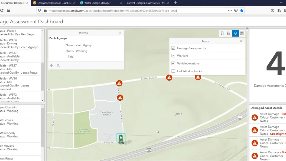
The easiest way to see this is with a situational awareness dashboard, shown below. This dashboard illustrates the locations of damage.
Gaining Situational Awareness Using Esri ArcGIS Dashboard Showing Damage
Understand
Once GIS captures the data, it helps me understand. It shows me patterns and relationships, like where are the closest crews and how long it will take them to arrive. It helps me predict and prepare. GIS's spatial analysis gives me the tools for precise decision-making. It takes the data you captured and combines it. For example, say a piece of cable is old. In that same location there is rocky moist soil. And there is a history of thawing and freezing in that area. GIS aggregates the factors to pinpoint where bad things are most likely to happen.
The analysis below is another example of how GIS shows risk and vulnerability. It illustrates the impact of an earthquake on water pipes
Vulnerability of Water Pipes Due to Soil Liquification After an Earthquake
GIS turns chaos into control by analysis of what might happen. That is, seeing where the network is most vulnerable before the nor'easter, wildfire or earthquake hits. That way, when it does hit, utilities can better manage, the heretofore unmanageable. So, here's a new oxymoron for you: manage the unmanageable.
Share
The third way to take the moron out of the oxymoron is to broadly share information. Again, dashboards are the perfect way to do that. Billions of people viewed the John's Hopkins COVID-19 Esri-based dashboards, and it helped drive policy. It gave a degree of order where none seemed to exist. I always like to say that operations management is about the three C's: communication, coordination and collaboration. ArcGIS takes its cue from social media, using maps to share information in real-time to anyone who needs it, both inside and outside the company. The three C's drive action.
The John's Hopkins COVID Esri Dashboard Changed the Perception of the COVID
GIS Brings Order to Chaos
Operations management is an oxymoron only if chaos prevails. Capturing and organizing information by location minimizes guesswork. Spatial analysis drives decision-making, and sharing location-based information broadly puts everyone on the same page. So, let's leave oxymoron expressions to jumbo shrimp, random order and dull shine.
Learn about how GIS can enable operations management download our latest e-book.


